A conscious creative studio building brands for tomorrow.

Look Good. Do Good.
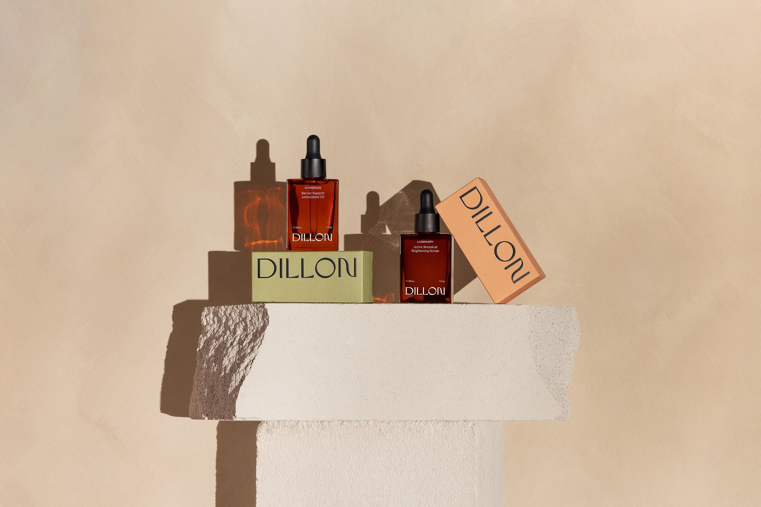
Our passion lies in partnering with purpose-driven businesses that are dedicated to leaving a positive imprint on the world. We specialize in crafting powerful, visually compelling brands that resonate with conscious consumers. By leveraging the art of design, we help you create a lasting impact, not only for your business, but for the communities you serve.